Total Pageviews

24 February 2011

Architectural Tattoos

I love to see Architecture as it relates to other works of art and all walks of life, so I looked around for some Architecture Tattoos. Below are some of the better of what I found:


I think at some point I will want a tattoo that relates to architecture in some form or fashion but I haven't decided where or what it will be. (It's not like I don't have a lifetime to decide...)

And because this is an architectural blog, here are some tattoos for buildings:

:)

Models

These images are grainy and imperfect, but I wanted to show some of the models I created last semester. I will more than likely be re-photographing them prior to their inclusion in my portfolio. It's a fun mix of landscape, hardscape (paving patterns, etc.), and built environments. I hope you enjoy.
Space Relationships (morphing connected spaces), FAMU SOA, Fall 2010

Pavillion, FAMU SOA, Fall 2010

Pavillion, FAMU SOA, Fall 2010
Pocket Park, Fall 2010, FAMU School of Architecture, Concept: Lilly pads on a pond (water levels under each pad)

Top view of Coffee Shop for FAMU, FAMU SOA,  Fall 2010

Coffee Shop for FAMU, FAMU SOA, Fall 2010

23 February 2011

Some images from my personal work

City(e)Scape, Acrylic on canvas, 2009
Hometown Map Project: Pensacola, India Ink on Mylar, Architectural Design 1.1, University of Miami 2004
Villa Savoye Precedent, Sketchup Design Project: "Bungalow," Florida Community College 2009
    
Design 1.1: House and Shop for 2 Sisters, University of Miami 2004, Basswood
Model

Keys, Colored pencil and Ink doodle, 2008

Flyer study, 2010
Marker Study, 2009


This is just a taste of some finished work with no process included. I have a ton more, but haven't adequately photographed my artwork or projects very recently. When I do, I'll be sure to share.

The Portfolio

As a student in the second year of undergraduate studio coursework, I am very intrigued with the portfolio process but have heard very little about what should be included, how to select the order of the interior elements and whether hard copies or electronic formats are preferred the most.

available at Amazon.com
I purchased both of these books last semester and although they are graphically interesting and full of pictures and tips, I have learned that the AIA actually recommends not being as elaborate with your portfolio presentation when applying for work or to graduate school. According to an article published in the AIA's Best Practices, February 2008:
"The layout and graphics should complement the work within the portfolio, rather than compete with it.
Be sure to use large, clear images; there is no excuse for poor quality photography. In an interview with Architect Magazine, Jan Harmon recommends that students place their work in chronological order so viewers can see their progress over the years. She also tells students to put their very best work on the last page because it is easy to keep a portfolio open to that page during an interview."

"...it is important to include construction documents if you have had experience developing them either in school or in the workplace. A working knowledge of BIM or CAD, if you have it, is important to demonstrate. Nonetheless, the contributors mentioned that they appreciate seeing hand-drawn sketches, either artistic or architectural. “Final renderings are nice, but process sketches that show design ideation offer more insight into design progression and logic,” explains Mike Mauch."

"How you present your portfolio is as important as the content in the portfolio itself. Potential employers assess your verbal communication skills during an interview as you present your work. A successful portfolio presentation should progress at the interviewer’s pace. Add interest to images by telling the story of the project."

"Your conversation should show you have researched the firm. Discuss how elements of your projects relate to the firm’s values. “I cannot emphasize this enough—the individuals who stood out for me over the course of more than 150 interviews were those who did not just go through the motions but understood what our firm was about and spoke knowledgably and with commitment as to why they believed they were a good fit,” Alan Ford affirms.

"The contributors generally dislike highly technical portfolios, online portfolios, and portfolios on CD. Sometimes online or CD portfolios look too polished, as if they are PowerPoint presentations,” states Debbie DeBernard. They lack the personal, artistic quality that can only be achieved by touching the paper and flipping page by page through the portfolio in person."

"Sometimes the design of the portfolio itself is too complex and over-designed. All of the respondents discouraged complex packaging. The focus should be on the design content of the portfolio, and the packaging should not overpower it. Keep text to a minimum; reviewers have limited time to read during an interview."

"Refrain from creating uniquely sized portfolios. Keep them at least 8.5” by 11”, nothing too small. In fact, consider that the viewer might use reading glasses, and keep text sizes at a normal reading scale."

This information can also be found here.

There also is an online checklist available for download in pdf format from the aia website. This checklist is meant to help with design layout, the order of your work, and to help you decide what should be the focal points of your graphic presentation.

16 February 2011

Bruce Holwerda

For our Artist's Retreat/Cabin on the Lake project, I selected the artist Bruce Holwerda as my client and precedent. After browsing a wide variety of genres and artists, I feel that not only does he offer a wonderfully different aesthetic appeal, but his artistic philosophy is fun and experimental (which also can translate wonderfully into a private retreat on a beautiful lakeside). Here are some of my favorite works of his: 

Distortion, Bruce Holwerda
Too Much Information, Bruce Holwerda

Synchronicity I Think, Bruce Holwerda


Eye On The Prize, Holwerda


"My passion as an artist has been the wonder of experimentation and the thrill of seeing the results of a finished piece. My history as a visual artist has been to play with the medium, to have fun with the subject and composition. I am a big fan of many forms of art. I love to study photo realistic landscapes and wildlife paintings, I am in awe of modern glasswork and am fascinated with bronze sculpture. But when my creative spirit kicks in, I want to paint..." 

"...Hopefully, my work will always continue to grow and evolve, combining fresh ideas and innovative executions." -The Artist Statement http://www.adamholwerda.com/bruceholwerda/aboutheart.html

He is also active in the Facebook Community and offers images on his blog on Tumblr. 
Please check out the artist's official website for more information, local art events he will be attending/displaying his works, as well as purchasing information. 

14 February 2011

Taking the green roof to greater lengths


Plans are developing for the first ever 5-star hotel and resort to be located mostly underground. We have all been exposed to the greening of built-up structures, and even the innovations of planting indoor trees, as in Jean Nouvel's 100 E 11th Avenue, New York, or garden terrariums, and green roof/grey water collection systems. In this vein, the firm of Reardon-Smith Architects has developed a complex as a response to the standard removal of green elements when providing parking spaces, living quarters, and spa elements. In their design there is little potential for obstructed view, and no chance of dreaded parking lot overlooks because the parking garage is located well below the surface of the earth, and courtyards provide partially canopied views and gathering spaces for guests.
Reardon-Smith Architects, Hersham Golf Club, Surrey, UK
The only concern I would have with building underground, aside from the cost incurred to carefully remove and re-transplant vegetation post-construction, is the potential for flooding.However, I do find this to be a very creative counter to our extreme sky-high cities, even those with green roofs and neighborhood vegetable gardens, and expect to see more strides to utilize underground potential in the future, especially as overcrowding in larger cities continues, and our population continues to grow exponentially. The architecture of the future will need to efficiently utilize space, reduce the carbon footprint, and offer more to its environment. And yes, they will still need to possess "Venustas, Utilitas, and Firmistas."-Vitruvius

13 February 2011

AutoDesk Software for Students

I am increasingly excited by the Autodesk Community's Decision to increase the 30 day student editions of various software such as REVIT 2011, AUTOCAD, MAYA, and a variety of other programs to a 3-year license. Please feel free to take advantage of this opportunity to bolster your technological experience and gain a competitive edge over other architects who may be in your job pool.

The AutoDesk community has also included video tutorials in order to aid in your potential success with their programs.

Rendering capability with Revit Architecture, LOCHSA ENGINEERING, SKYWALK
One of the biggest perks of Revit is the rendering capability. That, and you can draw fewer lines and achieve the same or a more advanced version of your typical CAD drawings. As a newbie to Revit, I still prefer the Autocad commands, but I am getting used to the software slowly but surely and am excited to add yet another program to my resume. 

Good luck, fellow classmates, as our first Revit project of the semester is due Wednesday!

12 February 2011

COPIC MARKERS - solohome (SPEEDDRAWING)

Hello! I was browsing YouTube today and found a quick rendering example using watercolors, ink and my favorite, COPIC Markers, which I found to be particularly relevant to my current design studio project. Right now, we are experimenting with coloring floorplans, elevations and sections using Prismacolor pencils, but any rendering skills are invaluable, especially when considering things to put into your portfolio.

"When we build, let us think that we build for ever..." -John Ruskin

While one of the greatest parts of being an architect (at least in theory, for me) is knowing that you have built something that will change the world around it and shape the lives of others, we must somehow realize that throughout history, not many buildings have been made to last forever. However, there is something romantic about knowing you have "made your mark on the world." For me, the greatest accomplishment will be whenever I walk through a finished structure that I helped design; that will be my "I made it!" moment. If it never comes, I know I will be disappointed, but I also realize there are many specializations within the design field, and a plethora of changing in-demand vocations as well. Therefore, I intend to continue expanding my skills in all areas, especially those I tend to struggle with, like public speaking, and will hope for the best.

...paved with the best of intentions

First off, let me begin by saying that in no way am I pretending that my views, thoughts, or opinions are ultimately profound, but I do believe there are beautiful things in the world that many of us never have the chance (or time) to uncover on our own, and that we may or may not benefit from seeing them. With that said, I intend to utilize this blog as a method of researching certain topics I think might help other Architecture students, as well as uncover new tools, methods, and creations of myself and others.

Today I found some wonderful works of art I think should be shared:

 
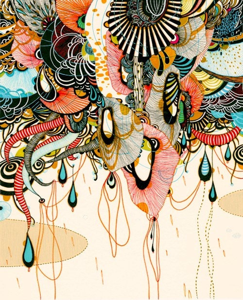
"Allusion" by Yellena on Etsy.com
"Carry On" by Audrey Kawasaki
"The Dark World Without" by Jeannie Paske
"Fox and Frog" by Lulabies
 and, because this will primarily be an architecturally-oriented page:

"Blomfield Street" by John Walsom

I also must confess that I may or may not have time to adequately update this blog, but am starting out with the very best of intentions. Enjoy!